
HVAC Vehicle Wrap Redesign: A Worked Example
Chris Graham · June 20, 2024 · Updated October 1, 2026
A worked example, with a company that does not exist
This post takes apart an HVAC van wrap, fix by fix. The company, the van and the layout are invented, so we can show what goes wrong without pointing at a real business. They are not a client of ours, and nothing here is a client result. The mistakes, though, are the ones we see on real vans all the time.
Why the layout matters
A service van spends its day in driveways and in traffic, in front of people who might need an HVAC company next week. Whether that does any work depends on one thing: can a stranger read it in the few seconds they get? A clear layout registers before a line of text is read. A cluttered one does not register at all.
That is the idea behind the 45 MPH Test: name, service category, brand promise, contact path and service area, all readable at speed. The example below fails it in familiar ways.
The starting point: a cluttered layout
Our made-up company has a van that looks like many real ones. The design is crowded, the logo looks dated, and the information a customer needs is hard to find.
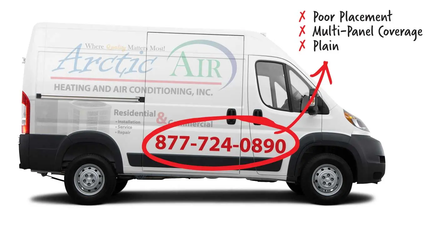
Illustration. The phone number runs across two panels and sits low against the black trim.
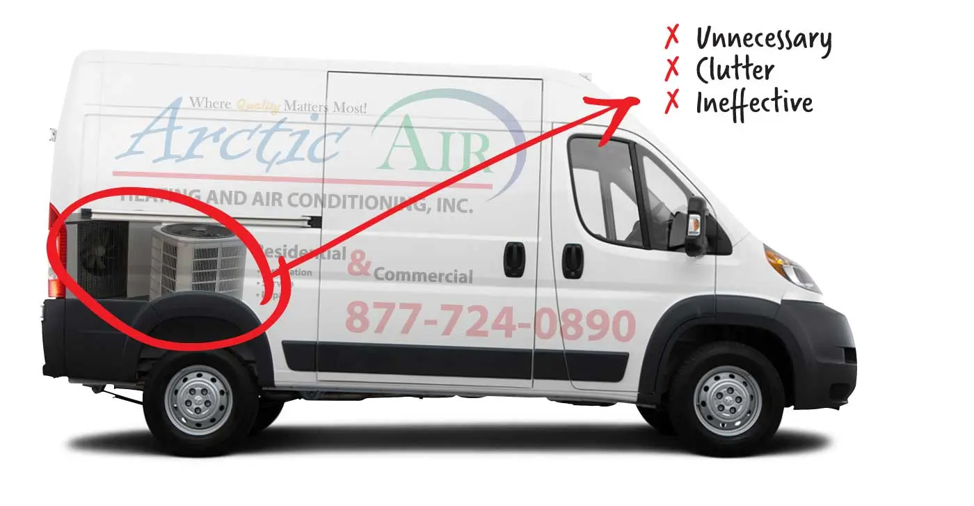
Illustration. A stock-style photo of the equipment adds clutter without saying anything the name does not.
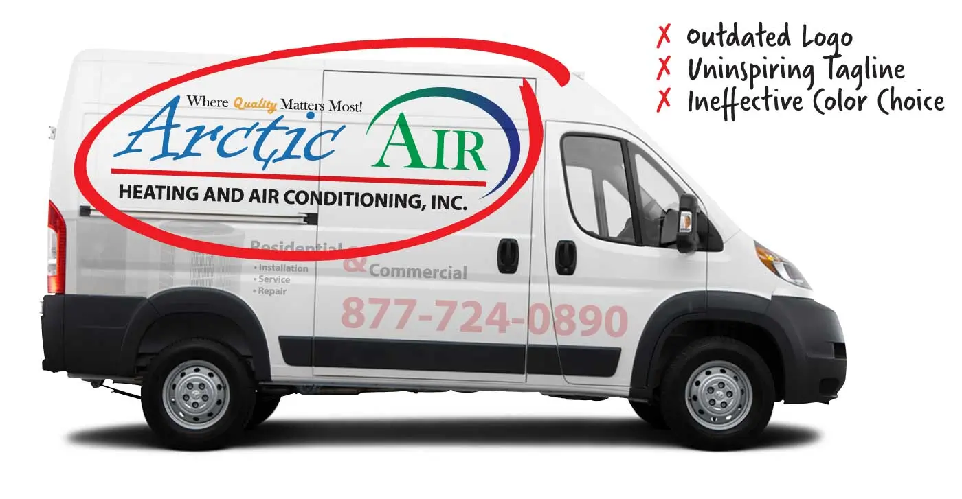
Illustration. A dated logo, a generic tagline and four competing colors.
What a better layout does
A redesign for this van would work on four things.
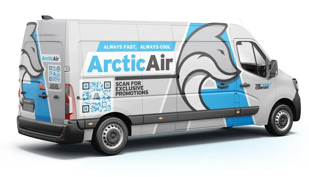
Illustration of a redesign for the same made-up company.
Brand consistency
One logo, one set of colors and one type style, used the same way on the van, the shirts, the website and the invoices. Consistency is what makes a brand easy to recognize and easy to trust.
Clear, specific messaging
A strong headline and a few key points that can be read from a distance. Anyone who sees the van should know what the company does and how to reach it, without working for it.
Quality visuals
High-resolution artwork that holds up at full size. A fuzzy or generic graphic makes a company look less established than it is.
Where the information goes
The name and the trade come first. The phone number or web address belongs high enough to read from the next lane. A QR code is optional, and it supplements the phone number rather than replacing it. Put it low on the rear panel, where a viewer is stopped and able to scan, and keep it from competing with the name.
How to tell whether your own van passes
You do not need a redesign to find out. Stand 100 feet from your van and ask whether you can read the name and the trade. Then ask a few customers how they found you. If "I saw your truck" never comes up, the layout may not be registering.
For a scored answer, the free Wrap Audit checks a photo of your van against the 45 MPH Test, category by category. If you want to see what a corrected HVAC layout looks like on real trucks, start with our HVAC vehicle wraps page.