
Vehicle Wrap Design
Vehicle wrap design built to pass the 45 MPH Test. Part of the BrandBlueprint ($3,750), quoted on every wrap we design.
Effective wrap design is about recall, not decoration. At 45 MPH a customer has about three seconds to understand who you are, what you do, what you promise, and how to reach you. We design to that reality, inside the brand direction the BrandBlueprint sets: one dominant message, a contact path legible from 50 feet, and a clear visual hierarchy, rather than a cluttered layout that wins design awards but loses customers at speed.
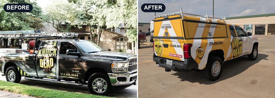
The 45 MPH Test
Company name, service category, brand promise, contact path, and service area where needed, legible in about three seconds at 45 MPH.
One dominant message
A clear hierarchy instead of competing elements fighting for the same attention.
Contact path placed to be seen
Name and contact path set large and high so cargo and equipment never block them.
At most two fonts
Clean, legible type. We correct the six-typeface layouts that kill readability at speed.
What clients report
$800K to $3.7M
revenue, two years after the rebrand
The Job Hog rebranded from Platinum Construction. Both figures are as the owner reported them.
Read the case study
1 to 4
trucks in eighteen months
Knock Em Dead Pest Control grew from a single wrapped truck to a four-truck fleet.
Read the case study
Both are growth the owners reported after rebranding, not a claim about what a wrap does on its own. The work did that. The brand is what made the market recognize the company doing it.
The 45 MPH Test
At 45 MPH, with the vehicle about 100 feet away, a customer has about three seconds. Every wrap we design is checked against the 45 MPH Test before it goes to print. Good wrap design is built for that window, not for a portfolio presentation.
- Company name: readable from 100 feet at 45 MPH, from both sides of the vehicle.
- Service category: the trade, stated in words, readable at the same 100 feet.
- Brand promise: one breath long, specific enough for customers to hold you to, legible from 50 feet.
- Contact path: a web address that matches the name, or a phone number legible from 50 feet.
- Service area: a city or region, when the name alone gives no local signal.
Most wrap design problems are hierarchy problems
Weak wraps rarely fail because they are unattractive. They fail because too many elements compete for attention at once: logo, generic slogan, phone number, website, service list, background graphic, certifications, and decorative effects. When everything is emphasized, nothing is. We reduce and prioritize so the eye lands on the right information in the right order, and the message lands before the truck turns the corner.
Where the contact path goes
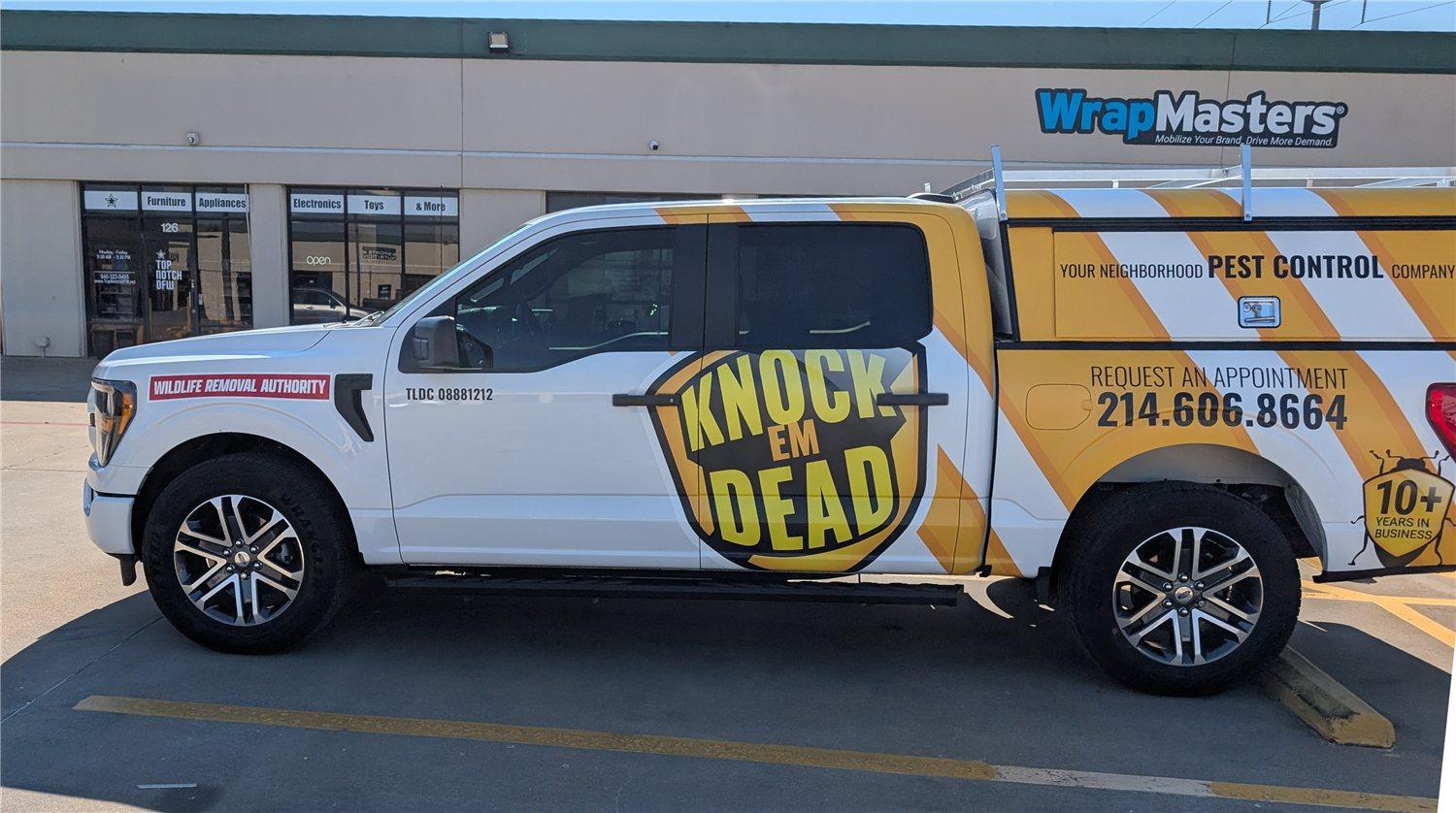
We place your contact path, the web address or phone number, large and high on the vehicle so cargo, ladders, and equipment never cover it. The most common mistake we fix is a design that was built to fill space rather than to be read by someone in a passing car.
Recent work
From the blog
Related reading
Vehicle Wrap Design
Why the Best-Performing Vehicle Wraps Aren't the Most Creative
The wraps that do the most for a business aren't the most creative ones. They're the clearest ones. Here's why clarity beats creativity at 45 MPH.
Read moreVehicle Wrap Design
Why Your Van Wrap Design Matters: Mastering Effective Vehicle Wrap Design
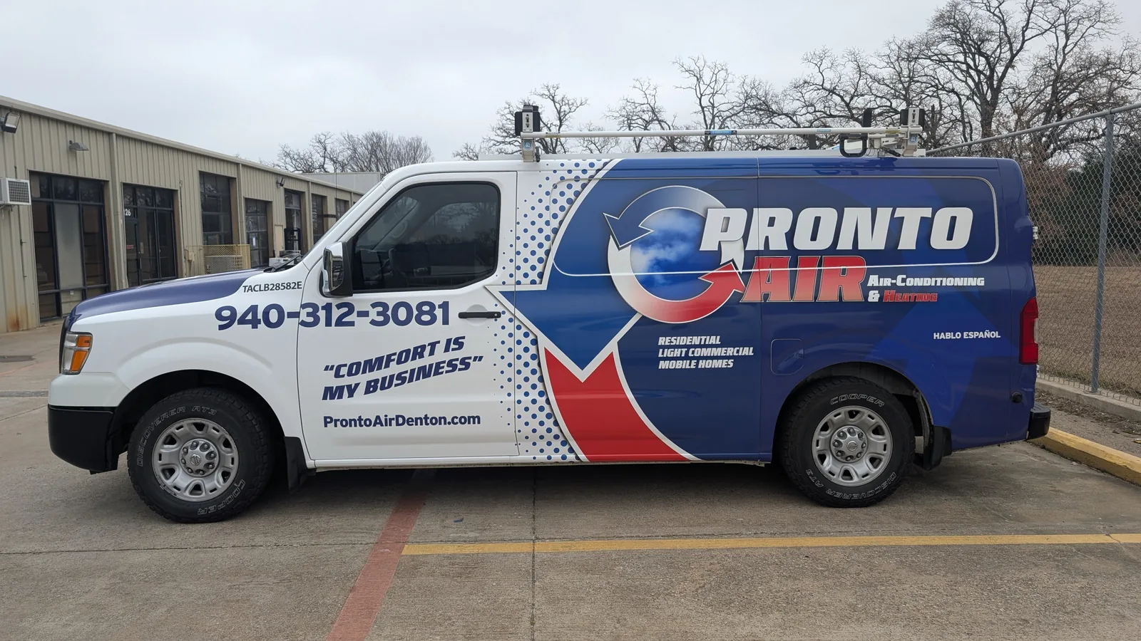
A candid critique of poor van wrap designs, comparing cluttered layouts and unreadable text to wearing socks with sandals. Here is how to build wraps that actually promote your HVAC services.
Read moreCommercial Car Wraps
8 Vehicle Wrap Design Mistakes That Cost Recognition
Vehicle wraps are more than a simple design aesthetic; they shape how customers perceive your brand, for better or worse.
Read moreVehicle Wrap Design FAQ
- What makes a vehicle wrap design effective?
- An effective wrap is legible in about three seconds at 45 MPH. That means a clear company name, an obvious service category, a brand promise customers can hold you to, and one clean contact path, plus a service area when the name gives no local signal, with a visual hierarchy that guides the eye in the right order. A design that cannot be read at speed is not performing, regardless of how it looks in a proof.
- Can you design a wrap from my existing logo and brand?
- Yes. We design around your current brand, and if your logo or layout is hurting readability we will flag it and recommend corrections so the wrap performs on the road.
- Do I get to review the design before it is printed?
- Always. You see proofs and approve the final layout before anything is printed or installed.
- Why do so many wraps look busy or hard to read?
- Most wrap design problems are hierarchy problems. When every element is treated as equally important, the design becomes a competition for attention. A clear hierarchy, where the company name dominates, the service category follows, the brand promise is short enough to read, and the contact path is easy to find, is what makes a wrap readable in motion.
Explore more
Wrap services
Industries we wrap
Don't be a stranger.
See where your current wrap is losing visibility. Upload a side or rear photo and get an instant 45 MPH Test visibility score. Free, no commitment.
New business or no wrap yet? Get started instead, no audit needed.